The Perfect Poster Storm
Like clothing, posters are fairly accurate indicators of time and place. Just as hemlines go up and down and lapels become narrower or wider, certain graphic styles go in and out of fashion, marking moments in social and cultural history and their points of origin. Unless the work is a convincing pastiche, it is easy to distinguish a poster made in the 1930s from one made in the 1950s or a poster made in the 1950s from one made in the 1960s and so on. And despite the continual return of old fashions as new, subtle and not so subtle nuances typically reveal the original era during which a poster was created. The collection of Dartmouth Winter Carnival Posters at Rauner Library supports this idea of historical specificity in the most vivid way possible. This is the perfect storm of poster art, not because every poster is perfect – some, in fact, are amateurish, while others are exquisite – but rather because it is extremely rare to find a collection focused on a single theme spanning such a broad period of time.
That the Dartmouth Winter Carnival was promoted and commemorated so completely through posters is quite an achievement. Parsing the history of posters, it is possible to find certain institutions, organizations, and events well represented, but few with such consistency as this. Any graphic design “archeologist” would find this “dig” a remarkable resource, if only to learn how dominant certain styles have been. Yet at the risk of sounding critical, the individual works in this collection are indeed dedicated followers – certainly not instigators – of fashion.
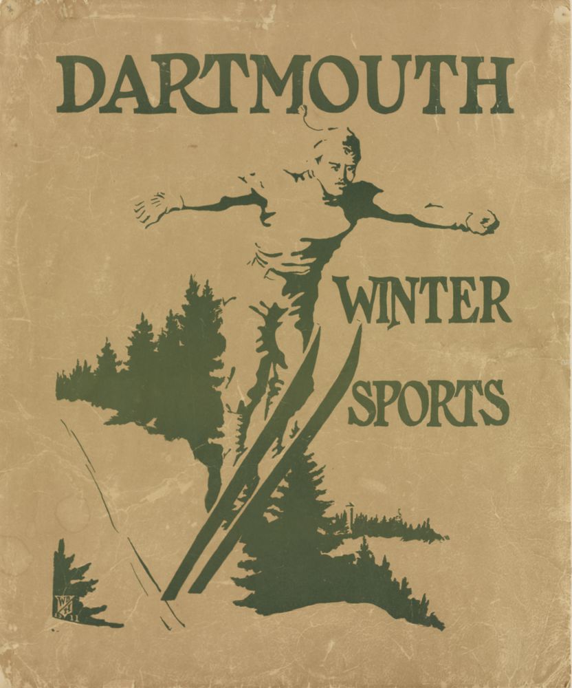
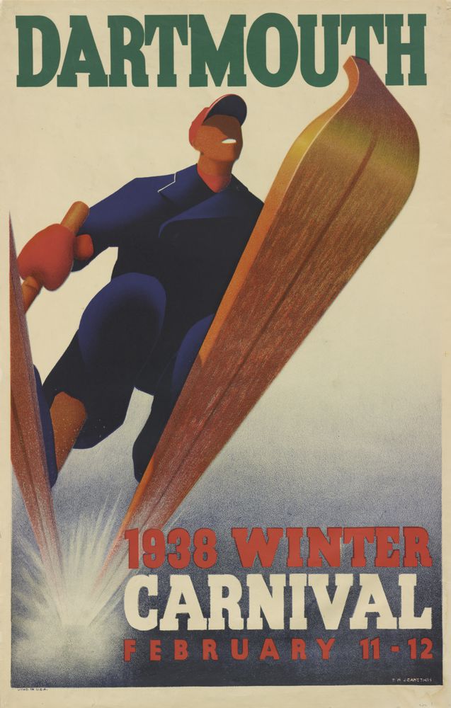
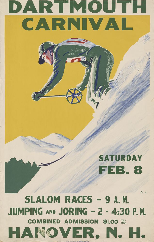
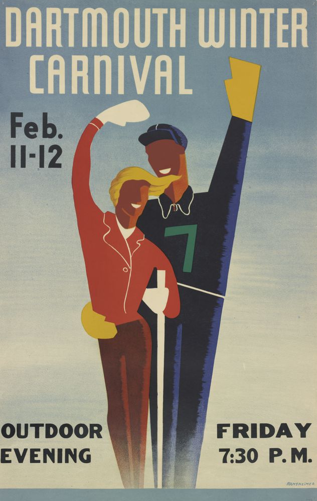
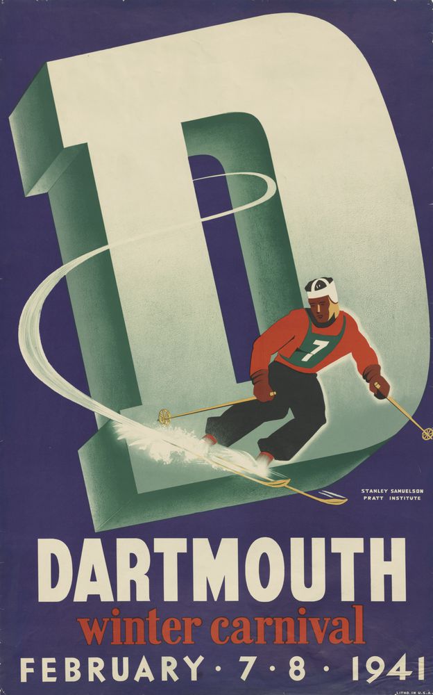
So what can be learned from these offerings? In 1911 (the earliest poster), a style of graphics introduced in the late nineteenth century is apparent: reduction of forms toward abstraction (page 34). The stiffly rendered chiaroscuro image in the 1911 poster mimics the style of the day. While it captures the action of the figure, however, it does so in an inelegant manner. By contrast, the 1935 poster is decidedly more confident in terms of form, concept, and action (page 35). (Note that the collection includes no posters from the years 1912 through 1934.) While skiing posters characteristically follow the same basic conventions (that is, they illustrate skiers zooming down slopes or flying up snow banks), how the designer or illustrator renders the action is key to making a cliché soar or fall. One of the 1938 posters, showing a wooden ski that appears about to fly out of the frame into the viewer’s face, is a powerfully expressive and decidedly mnemonic image (page 40). It is also a perfect stylistic copy of work by the Austrian posterist Joseph Binder (known for removing all detail from the human figure, leaving just the salient features) and Otis Shepard (Binder’s primary acolyte, famously known for his Wrigley’s Doublemint gum posters that placed a focused emphasis on the pearly white teeth).
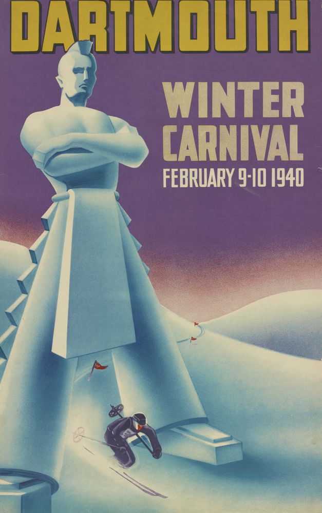
Although I had never heard of the Dartmouth Carnival poster artists before, those who worked in the 1930s and 1940s were clearly very skilled exponents of what was called “streamline” or “art moderne” design. The most popular tools of that time were the airbrush and litho crayon, which reveal themselves throughout the collection. One of my favorite images, from 1940, is not simply representational but is a conceptual tour de force that layers various messages while retaining a sublime simplicity (page 45). And it is colorful, too.
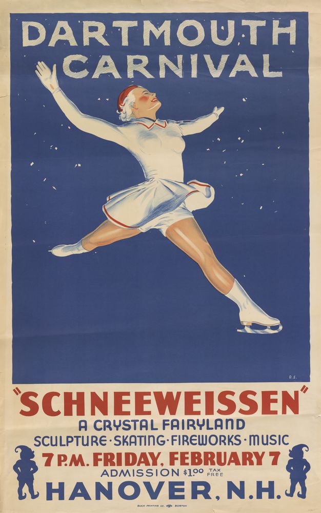
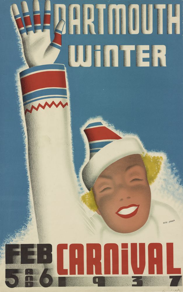
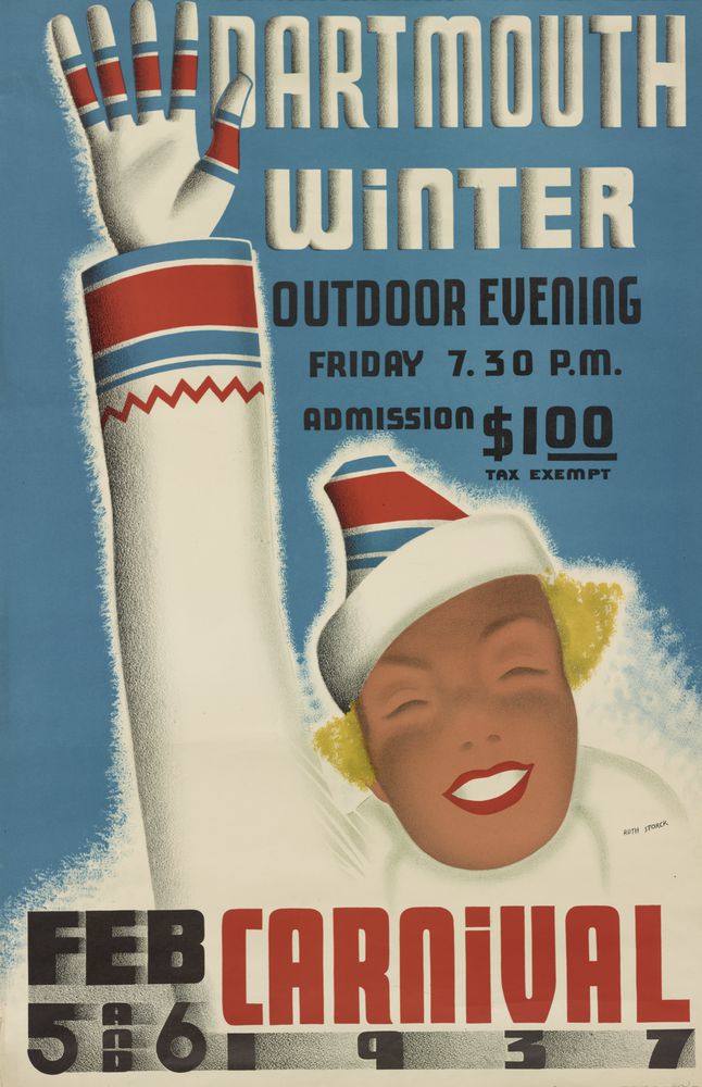
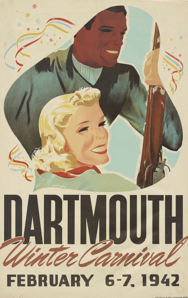
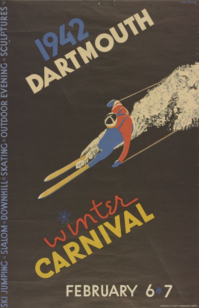
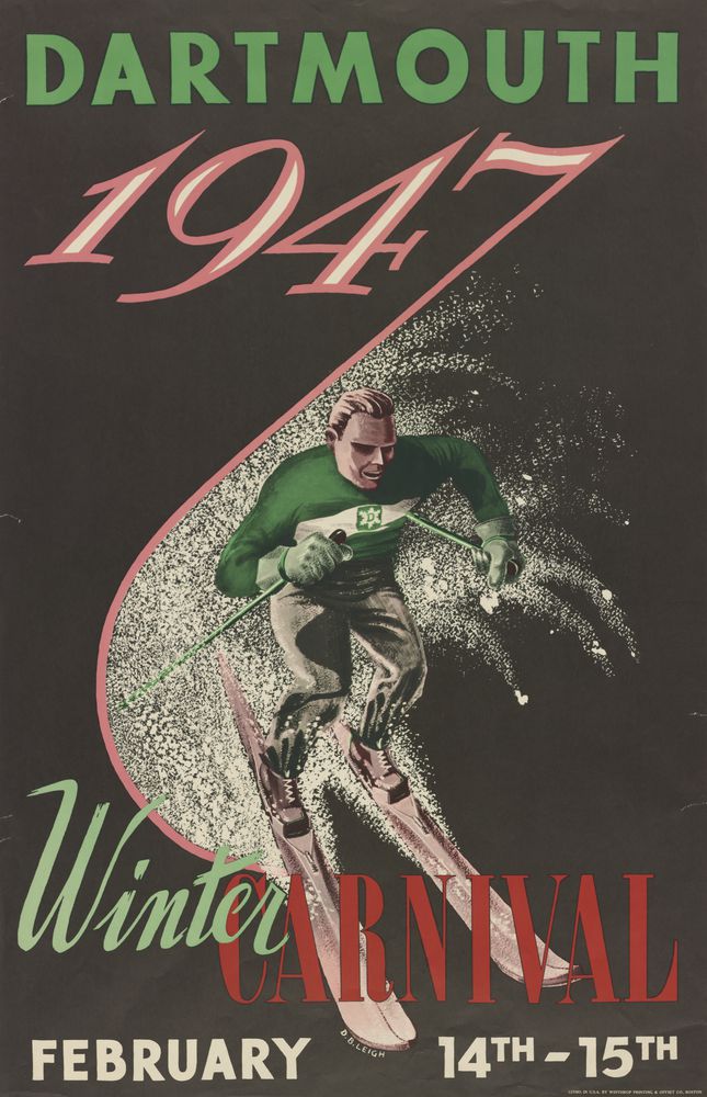
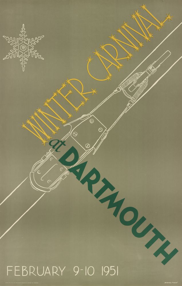
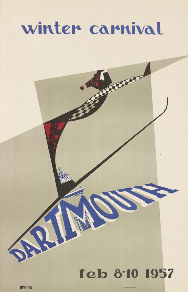
Throughout the 1930s and 1940s (after a brief hiatus for World War II), the posters continue to show the patina of the gradually fading moderne approach (pages 35, 36, 37, 38, 39, 40, 41, 42, 43, 44, 45, 46, 47, 48, 49, 50, 51, & 52). By 1951, a kind of faux Bauhaus Constructivism is introduced, exemplified by the diagonal type treatment and schematic illustration (page 54). Unlike the pre-war avant garde that influenced it, however, this poster is kitsch (observe the excessive use of snowflakes). By 1953, kitsch imposes itself even more. For instance, the lettering that spells out “Winter Carnival” on that year’s poster, influenced by Italian Futurism, is made silly by the inclusion of polar ice caps, not unlike the lettering common on ice machines (page 56). I call this sort of styling “typography parlant,” because it speaks to the purpose of the word or phrase. Not until 1957 does the old-fashioned or retro style give way to a somewhat contemporary design scheme. While the Dartmouth headline is typical of varsity lettering, the skiing figure is rooted in the jazzy idioms of the day, popularized in movie titles by Saul Bass (page 60). If the designer had removed the headline, the poster would have represented a radical stylistic shift. Instead, it is like a modern building with a classical façade, suggesting compromise and lack of confidence.
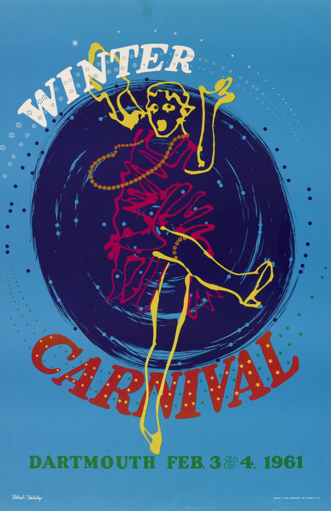
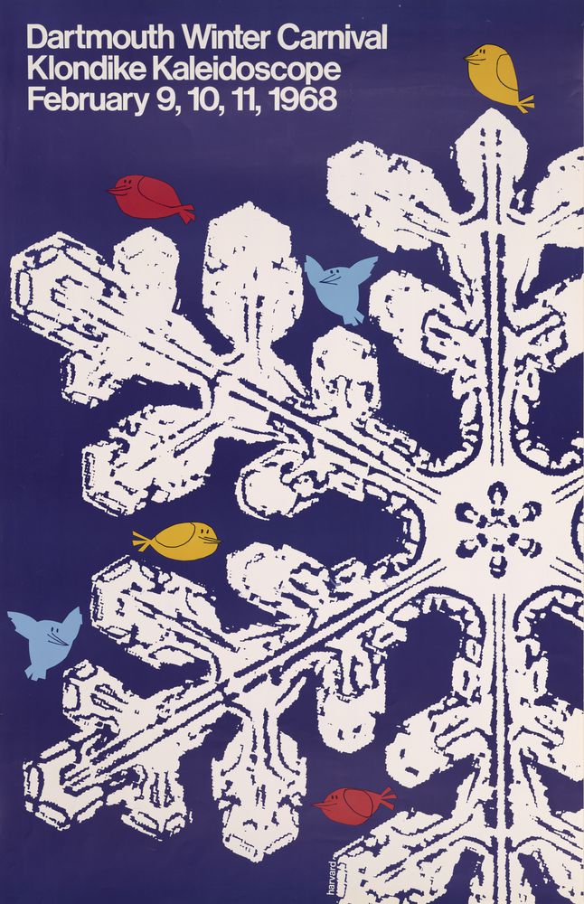
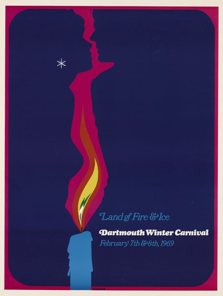
By the 1961 poster, graphics change radically for the worse. The Winter Carnival flapper, an energetic drawing, is overpowered by the lettering and the inexplicable black vortex behind the dancing figure (page 64). The clever parody of West Side Story in the 1962 “North Side Story” poster is a nice try at echoing the original musical’s emblematic poster, which features linear, high-contrast fire escapes attached to the lettering (page 65). However, the typography here seems an afterthought. A number of attempts at developing new graphic idioms appear in subsequent posters, but only a few come close to success. The extra-large snowflake from 1968 echoes the Swiss or International School design aesthetic of that era, with a little added humor to prove it’s not an exact copy (page 72). The vibrating color poster of 1969 echoes the Psychedelic sensibility without copying the originals too much (page 73).
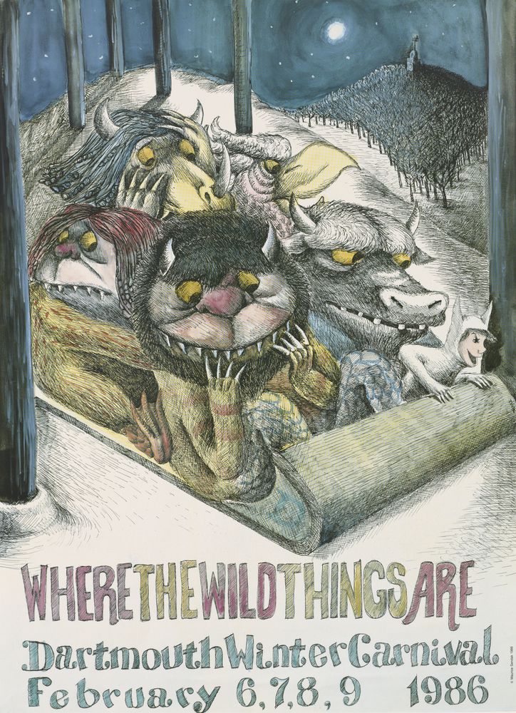
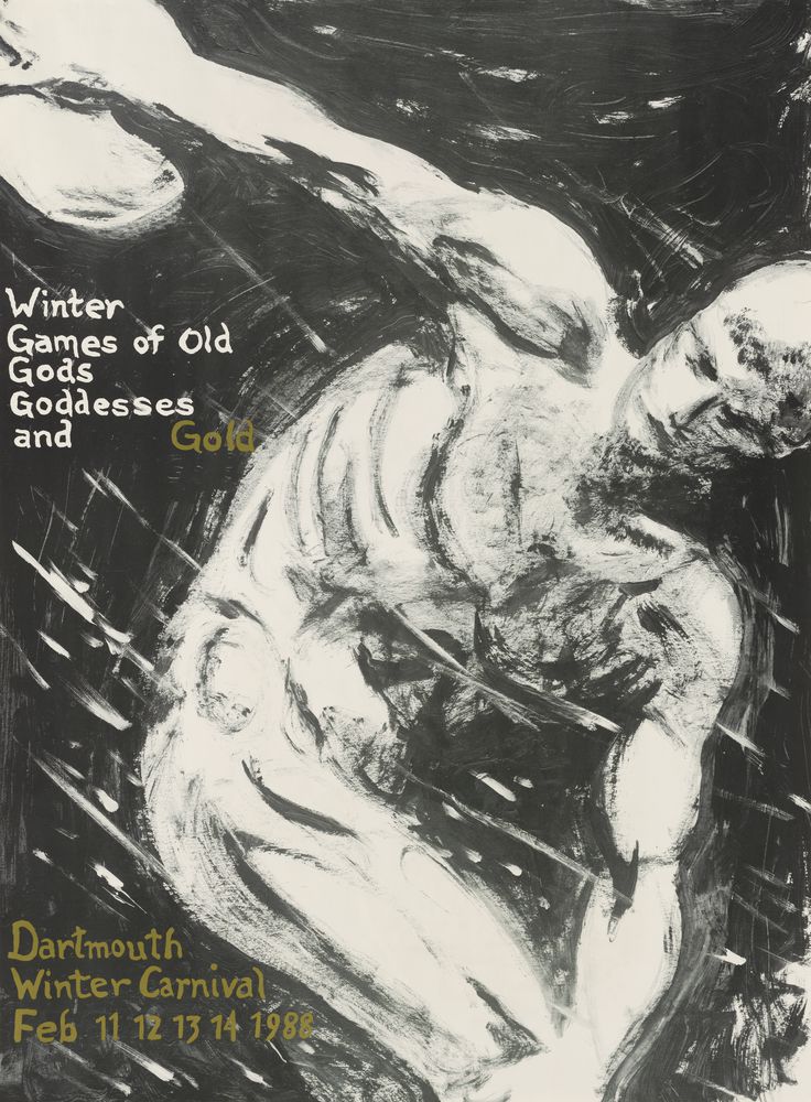
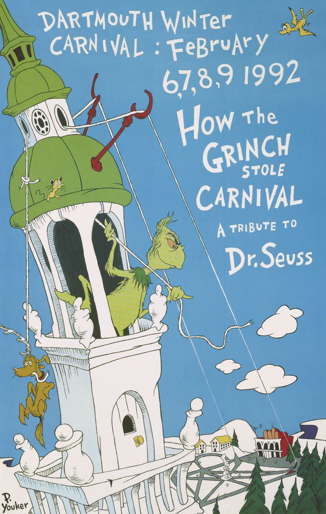
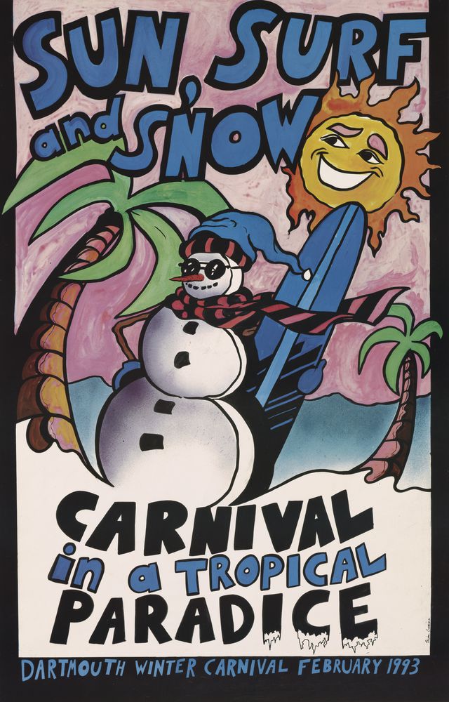
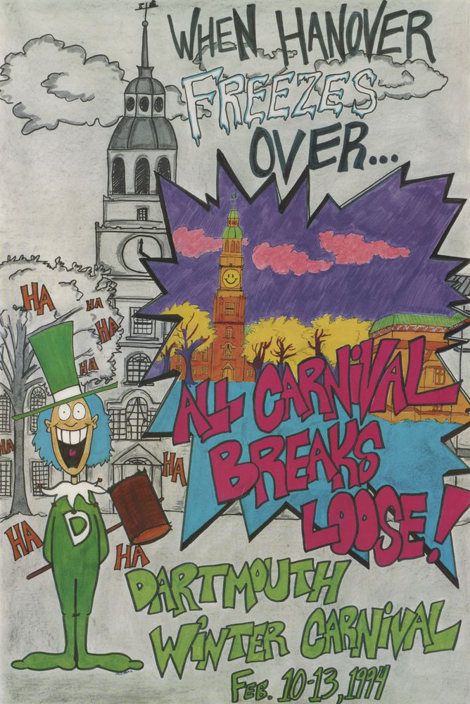
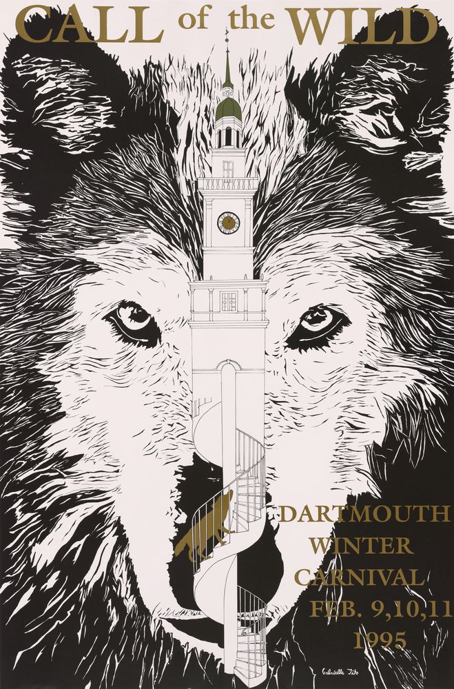
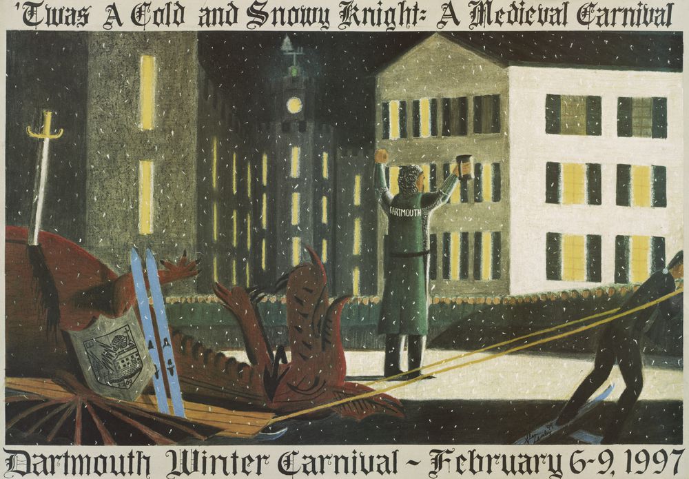
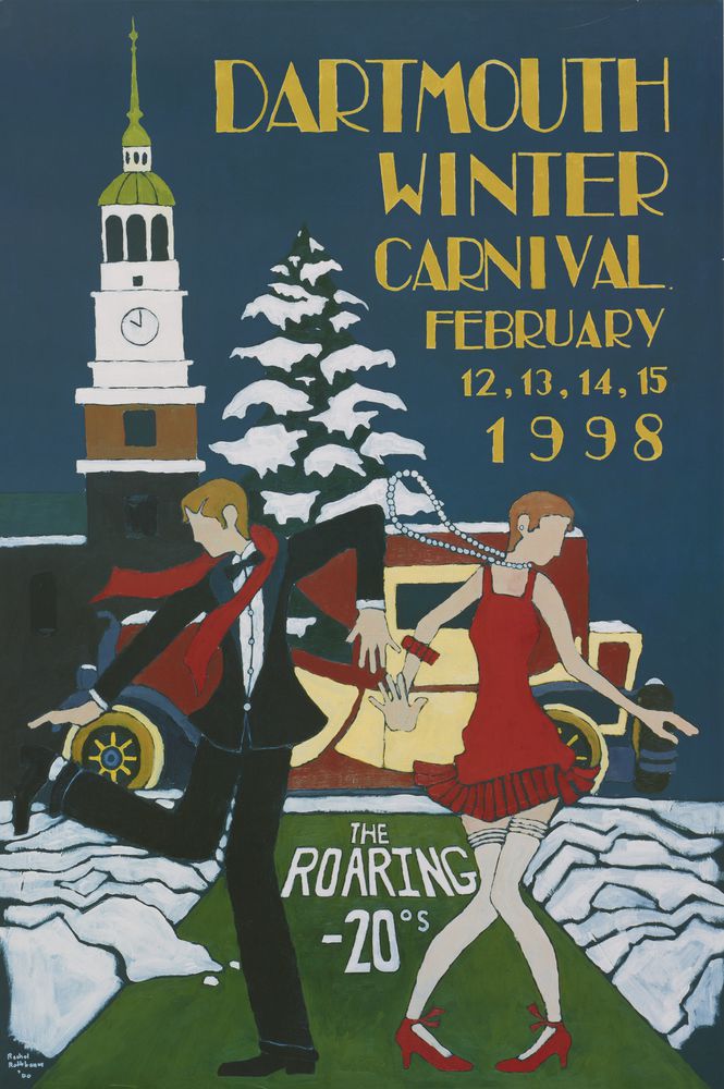
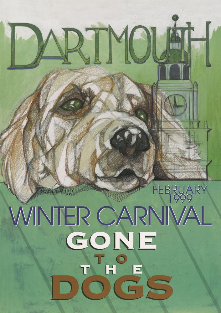
Curiously, the overall quality of the posters declines markedly in the 1980s and 1990s, as styles tend to blend into one another (pages 86, 87, 88, 89, 90, 91, 92, 93, 94, 95, 96, 97, 98, 99, 100, 101, 102, 103, 104, & 105). Perhaps this can be attributed to the decline of mass commercial graphic styles in the era of “deconstruction,” an experimental approach to typography that demanded an insider’s connoisseurship of graphic design. The poster artists pull from many sources (a characteristic of postmodern design at the time) but seem to be directionless. Some designers use satire (such as the 1986 parody of Maurice Sendak’s Where the Wild Things Are, page 92) and others employ classicism (including the 1988 discus thrower, page 94).
This critique is not intended to demean these posters, but rather to place them in context. The historical continuum they represent is amazing. Even more valuable is the fact that they have been preserved not just as nostalgic souvenirs, but as a body of work, representative of an era in which the poster – a form that is gradually dying in the online, virtual world – was a major means of mass communication.